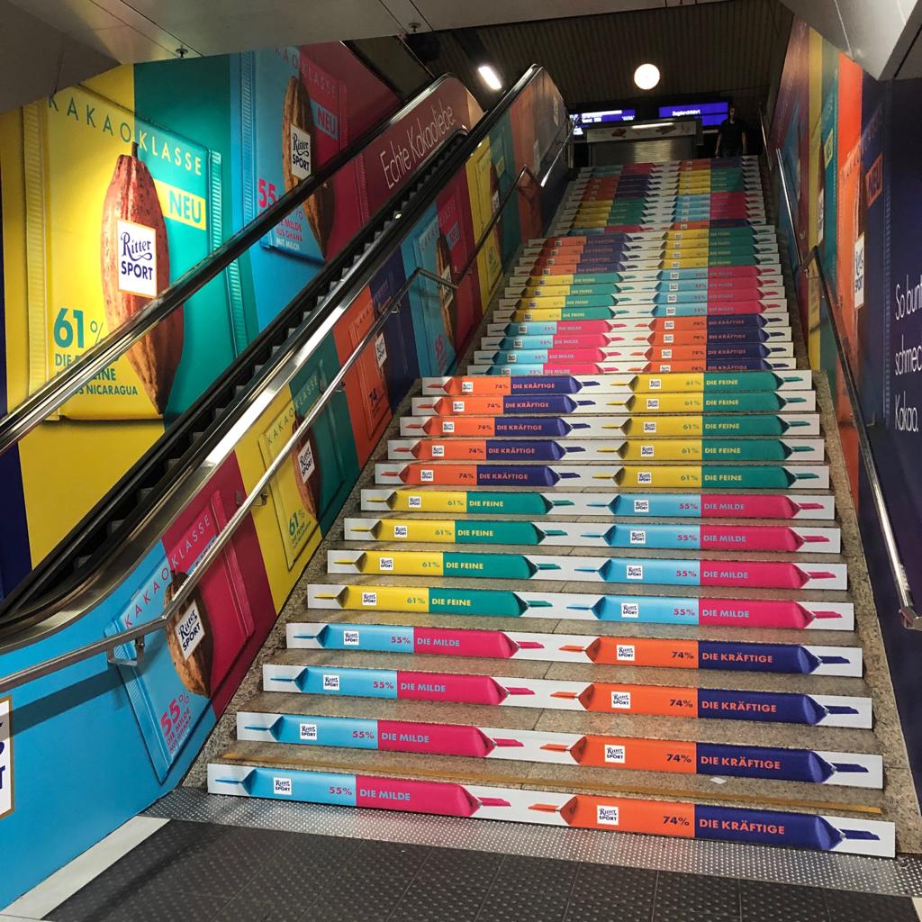
Color plays a crucial role in event graphics, influencing how attendees perceive and interact with your brand. The right colors can evoke emotions, enhance your message, and create a memorable visual experience. In this blog post, we’ll explore the significance of color in event graphics and how your color choices can convey your brand’s identity and values.
1. Understanding Color Psychology
Color psychology is the study of how colors affect human emotions and behavior. Understanding this can help you choose colors that align with your brand’s message and objectives:
- Red: Often associated with excitement, energy, and urgency, red can grab attention and stimulate action. It’s ideal for promotions and creating a sense of urgency.
- Blue: Conveys trust, professionalism, and calm. Blue is commonly used by financial and tech brands to establish credibility and reliability.
- Green: Symbolizes growth, health, and tranquility. Green is effective for brands focused on sustainability, wellness, and nature.
- Yellow: Represents optimism, creativity, and warmth. Yellow can attract attention and stimulate mental activity, but it should be used sparingly to avoid overwhelming viewers.
- Purple: Associated with luxury, creativity, and wisdom. Purple can add a touch of sophistication and elegance to your event graphics.
- Orange: Evokes enthusiasm, innovation, and friendliness. Orange is effective for brands aiming to create a fun and energetic atmosphere.
- Black: Represents sophistication, elegance, and authority. Black can add a sense of luxury and professionalism to your event graphics.
- White: Symbolizes purity, simplicity, and clarity. White is often used for minimalistic designs and can create a clean, modern look.
2. Reflecting Your Brand Identity
The colors you choose for your event graphics should reflect your brand’s identity and values:
- Consistency: Use colors that align with your brand’s existing color palette to maintain consistency across all touchpoints. This helps reinforce brand recognition and cohesion.
- Target Audience: Consider the preferences and cultural associations of your target audience. Different colors can have varying meanings and emotional impacts depending on cultural contexts.
- Brand Personality: Select colors that match your brand’s personality and message. For example, a tech company might use sleek, modern colors like blue and gray, while a creative agency might opt for vibrant and playful hues.
3. Creating Visual Hierarchy and Emphasis
Effective use of color can help create visual hierarchy and guide attendees’ attention:
- Highlighting Key Information: Use contrasting colors to highlight important information, such as event dates, key messages, and calls to action. This ensures that critical details stand out and are easily noticed.
- Segmentation: Different colors can be used to segment information or areas within your event graphics. This helps attendees quickly identify and understand different sections or elements.
- Visual Flow: Create a visual flow that guides the viewer’s eye through the graphic. Use color to lead the viewer from one element to another in a logical and engaging manner.
4. Enhancing Mood and Atmosphere
Colors can influence the overall mood and atmosphere of your event:
- Energetic Events: For high-energy events like product launches or concerts, use bright, bold colors to create an exciting and dynamic atmosphere.
- Professional Events: For conferences or corporate events, opt for muted, sophisticated colors to convey professionalism and seriousness.
- Relaxing Events: For wellness or outdoor events, choose calming colors like green and blue to create a serene and relaxing environment.
5. Ensuring Color Accuracy and Quality
To achieve the best results, ensure that your color choices are accurately represented in your event graphics:
- Color Matching: Use color matching tools and Pantone guides to ensure that the colors used in your graphics are consistent with your brand’s official palette.
- High-Quality Printing: Work with a professional graphics provider that uses high-quality printing techniques to accurately reproduce your chosen colors. This ensures that your graphics look as intended and maintain their impact.
6. Testing and Feedback
Before finalizing your event graphics, test your color choices and gather feedback:
- Mockups: Create mockups of your event graphics and review them in various lighting conditions to see how colors look in different environments.
- Feedback: Seek feedback from stakeholders or a sample audience to gauge their reactions and ensure that the colors effectively convey the desired message and emotional response.
7. Partner with a Professional Graphics Specialist
Choosing the right colors for your event graphics can be complex, but a professional graphics specialist can help:
- Expert Guidance: A graphics expert can provide valuable insights and recommendations on color choices that align with your brand and event objectives.
- High-Quality Production: Partnering with a specialist ensures that your event graphics are produced with precision and quality, accurately reflecting your color choices and brand identity.
EventGraphics is here to help you make informed decisions about color and design for your event graphics. Our team of professionals specializes in creating visually compelling graphics that align with your brand’s identity and enhance your event’s impact.
EventGraphics – The Event Graphic Specialists is your trusted partner for designing effective and vibrant event graphics. Contact us today to learn more about how we can help you choose the perfect colors and create graphics that make a lasting impression on your audience. Let us assist you in bringing your brand’s vision to life with stunning event graphics that capture attention and convey your message.

