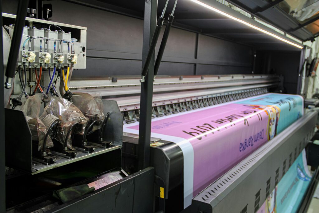
Learn about common pitfalls in event graphic design and how to avoid them to ensure a successful outcome.
Designing event graphics can be a complex process, and even the most experienced designers can fall into certain traps. To ensure your event graphics are effective and impactful, it’s crucial to avoid these common mistakes. Here are the top five mistakes to watch out for when designing your event graphics and how to avoid them.
1. Overcomplicating the Design
Mistake: Trying to include too many elements in your graphics can lead to a cluttered and confusing design.
Solution:
- Simplicity is Key: Focus on a clean, simple design that clearly communicates your message.
- Prioritize Elements: Identify the most important elements and give them prominence in your design.
- Whitespace: Use whitespace strategically to allow your design to breathe and avoid overcrowding.
2. Ignoring Brand Consistency
Mistake: Inconsistent use of branding elements can dilute your brand message and confuse your audience.
Solution:
- Follow Brand Guidelines: Ensure all graphics adhere to your brand’s color scheme, typography, and overall style.
- Unified Look: Maintain a consistent look across all event graphics to create a cohesive and professional appearance.
- Brand Elements: Incorporate key brand elements, such as logos and taglines, in a consistent manner throughout your designs.
3. Poor Readability and Legibility
Mistake: Using fonts and colors that make text difficult to read can diminish the effectiveness of your graphics.
Solution:
- Font Choice: Choose clear, legible fonts that are easy to read from a distance.
- Color Contrast: Ensure there is sufficient contrast between text and background colors to enhance readability.
- Text Hierarchy: Use different font sizes and weights to establish a clear hierarchy of information.
4. Neglecting the Audience
Mistake: Failing to consider the needs and preferences of your audience can result in graphics that do not resonate or engage.
Solution:
- Audience Research: Understand who your audience is and what appeals to them.
- Tailored Design: Design your graphics to cater to the interests and preferences of your target audience.
- Feedback: Gather feedback from a sample of your audience to refine and improve your designs before the event.
5. Not Planning for Installation
Mistake: Overlooking the practical aspects of installing and displaying your graphics can lead to logistical issues and subpar presentations.
Solution:
- Site Inspection: Conduct a thorough site inspection to understand the layout and any restrictions.
- Material Choice: Choose materials that are suitable for the venue and conditions.
- Professional Installation: Consider hiring professionals to ensure your graphics are installed correctly and safely.
Conclusion
Avoiding these common mistakes can significantly enhance the impact of your event graphics and contribute to a successful event. By focusing on simplicity, maintaining brand consistency, ensuring readability, understanding your audience, and planning for installation, you can create graphics that effectively communicate your message and engage your audience.
EventGraphics is the partner you need to avoid these pitfalls and ensure your event graphics are a success. With our expertise and attention to detail, we help you create impactful and memorable graphics for your events. Trust EventGraphics – The Event Graphic Specialists to deliver professional and effective event graphics that elevate your brand and captivate your audience. Contact us today to learn how we can support your next event.

